 Written by
 IntelliFlow lets you build great and secure web and mobile apps.
This is what you need to get started:
Objective:
The following document will give the citizen developers and end users of software owned by Intelliflow Solutions Private Limited (Hereby referred to as IntelliFlow) a detailed view on how to utilize the platform to achieve the best results.
SignUp:
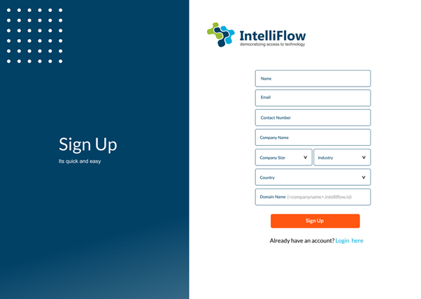
Choose between the various plans that will suit your needs, ranging from free to paid version of IntelliFlow platform. This will lead you to the signup page.
Step 1: New User Registration
To start using the services provided by IntelliFlow, you have to register with your personal/company details. Provide all the necessary information to the best of your knowledge and click on ‘Sign Up’
Note: You must have a valid email address and contact number to register
Step 2: Receive Confirmation Email
The screen will direct you to Check the email address provided in step 1. Click on the link that you received to set up your account password.
Note: You will need to access to the email address you have provided in step 1
Enterprise Users: Our sales contact person will contact you on the phone number provided in step 1 and help set up your enterprise account. If you need to set up a custom domain for your company, the process may take upto 24hours. Once the domain is set up, you will receive a confirmation email to set up the account password. This email address and phone number will also be held on our file as a person of contact for any future communications.
Note: The user/email address provided will act as an admin by default. These role settings can be transferred to another user in your company at a later point
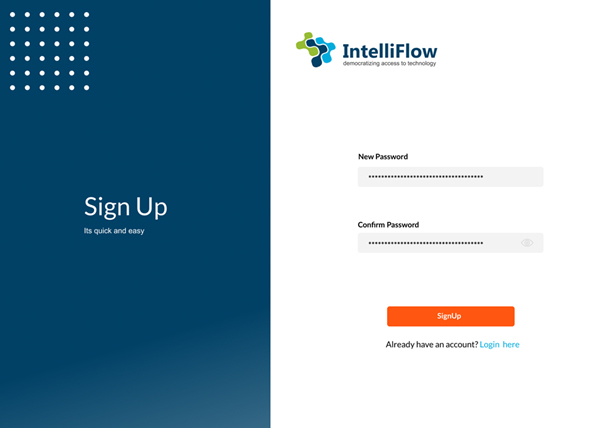
Step 3: Create Password
By clicking the link received in step 2, you can create a password.
- Enter a password in the ‘New Password’
- Re-enter the same password in the ‘Confirm Password’
Click on ‘Sign Up’
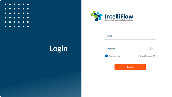
Login:
Step1: Email & Password
Enter your Email & Password to login
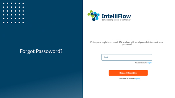
Forgot Password:
In case of forgotten password, click on “Forgot password?” hyperlink on the login page.
Step1: Request Reset Link
- Enter the email address associated with your account and click on “Request reset link”
Step 2: Click the link in you email
- Click the link in your email to help you reset the password.
- If you couldn’t click on the link, please copy the link and paste in your web browser
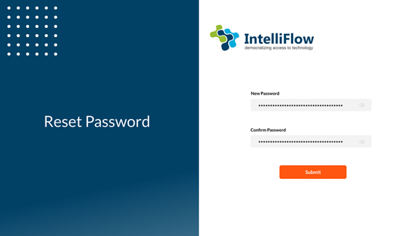
Step 3: Reset Password
- Enter your new password and reenter the same password in “Confirm password” field. (Make sure the new password is according to the password policy)
- Click “Submit”
You have successfully reset your password. This will be your new password to login to your IntelliFlow account. You old password will no longer be valid
Password Policy:
The purpose of this policy is to establish a standard for the creation of strong passwords.
Passwords must be created and managed in accordance with this section.
Password Requirements
- Passwords must be at least eight characters in length. Longer is better.
- Passwords must contain both uppercase and lowercase characters (e.g., a-z and A-Z).
- Passwords must contain at least one number (e.g., 0-9).
- Passwords must contain at least one special character (e.g., @,#, _)
Dashboard:
User dashboard will be a quick of all the mini-apps you have access to. There are two kinds of dashboards
- App Designer
- App Store
The dashboard you have access to is determined by the role you have within the workspace. User can have access to one or both of the above.
App Designer
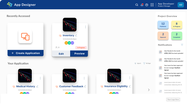
This dashboard is visible only to the citizen developers who have access to the edit the applications in the development environment.
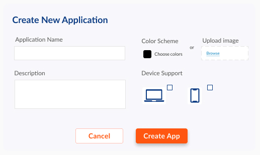
Create a mini-app:
- Click on the “Create Application” card on the screen
- Enter the details in all the fields on the “Create New Application” pop-up
- Click on the “Create App” button
App development:
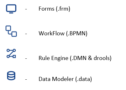
Asset: Any file that is created on the platform as a form, workflow, business rule or a data model as part of development is being referred to as an “Asset”.
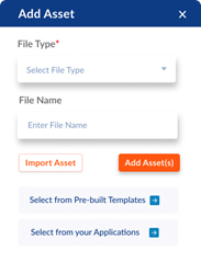
Add Asset:
Once a new mini-app is created, follow the steps as below:
- Click the icon on the top right corner of the screen
- Select the kind of asset you want to create from the drop down
- Give the asset a name of your choice in the “File Name” field
- Click on “Add Asset”
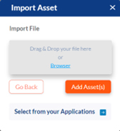
Import Asset:
- Click the icon on the top right corner of the screen
- Click on “Import Asset” button”
- Browse your local drive and select the files you want to import
- Click on “Add Asset(s)”
Form Builder:
Components:
1) Default will form section-1. At the right-hand corner of each section, you will see options to move, copy/duplicate section, ‘+’ sign to add a section, delete, move the sections up and down, etc., Once you double- click on the section, you will get properties of section as follows:
a) Section Name
b) Description
2) Text Box:
a) Select category (dropdown menu):
i) Text box (Any type of data, including numbers and special characters are allowed)
ii) Text area (For large text boxes like description or address. Text box won’t wrap the text but text area will.)
iii) Email ID (Will have to add validation, so only email can be allowed to enter)
iv) Phone number (Only numbers are allowed)
v) Rich Text (Can add images, color text, shapes, tables etc.,)
(1) Select category
(2) Field Name (Unique name for each field in the application, cannot be changed once the app is published. Only visible to the citizen developer)
(3) Label Name (Visible to the end user, can be changed at any point of time)
(4) Choose type (Editable by the user or not. Name them as static and dynamic?) Once done with the selections, it opens a rich text editor which will give all the options like, inserting an image, table, changing the font, size, color, bullets/numbered paragraphs, headings etc.
a) Field Name (Unique name for each field in the application, cannot be changed once the app is published. Only visible to the citizen developer)
b) Label Name (Visible to the end user, can be changed at any point of time)
c) Help text (Will show up when the user hovers the cursor over the field)
d) Default Value (If any can be added here)
e) Display format
f) Enable Scanner (Will be check box. If enabled by the citizen developer, the end user can scan a QR code or barcode to enter the data in the field)
g) Calculate (This will be a pop-up window once the citizen developer clicks on it. Which will give them option to select already defined fields and create a formula like “Concatenate fields” “Remove portion of a string” etc., They can also map their fields to login details or any external data source from this. There will be a preview button to check their formula’s function and validity)
- i) Auto-Generate
- i) Prefix (If the citizen developer wants to add a prefix to the autogenerated data, they can do so here)
- ii) Suffix
iii) Starts From (The starting value of whatever sequence that needs to be generated, can be both numbers or characters)
- j) External Reference
- i) Reference type
(1) Data Table reference
(2) Data Source reference (Combination of data tables)
- ii) Select the data table (Data tables can be mapped by the citizen developer into the form builder. Those mapped tables will show up here and they can select the relevant one)
iii) Select data table function (Usually set to “Get” data table)
- iv) Function type (Single/ multiple data fields that needs to be fetched. Then let the citizen developer select which fields are to be fetched. This will create the necessary fields on the form and the fetched data will be shown in respective fields)
- k) Required field validation (Checkbox)
- l) Pattern validation (When the box is checked we will show them options to validate that particular field. For length validation, options of minimum and maximum characters will be allowed. Same with Pattern, citizen developer can make certain characters or numbers unusable for the end user. We can also provide predefined validations like, US phone number, alphabets only, exactly 5 characters/letters/numbers only, years, Time only, date only, landline number only etc. We should also allow the citizen developer to try out their validation immediately by providing a “Try it out” Text box)
- m) Accessibility (role based) (A button, once clicked will show options of read-only, write and hide. Next to each option, there will be two dropdowns, one with “User” and another dropdown with “Work group”. The drop downs will show them available work groups and users.)
3) Number
- a) Field Name
- b) Label Name
- c) Help Text
- d) Default Value
- e) Whole number or Decimal (radio buttons)
- f) Enable scanner
- g) Display format
- h) Auto-Generate
- i) Prefix (If the citizen developer wants to add a prefix to the autogenerated data, they can do so here)
- ii) Suffix
iii) Starts From (The starting value of whatever sequence that needs to be generated, can be both numbers or characters)
- i) External Reference
- i) Reference type
(1) Data Table reference
(2) Data Source reference (Combination of data tables)
- ii) Select the data table (Data tables can be mapped by the citizen developer into the form builder. Those mapped tables will show up here and they can select the relevant one)
iii) Select data table function (Usually set to “Get” data table)
- iv) Function type (Single/ multiple data fields that needs to be fetched. Then let the citizen developer select which fields are to be fetched. This will create the necessary fields on the form and the fetched data will be shown in respective fields)
- j) Required Field validation
- k) Pattern Validation (Can select predefined or custom patterns)
- l) Range validation (Once clicked, “From” and “To” fields will show up)
- m) Calculate (Will be a pop-up that will help the citizen developer create a new formula or select from predefined formulae along with a preview button to check their formula’s function and validity)
- n) Accessibility (role based) (A button, once clicked will show options of read-only, write and hide. Next to each option, there will be two dropdowns, one with “User” and another dropdown with “Work group”. The drop downs will show them available work groups and users.)
4) Date & Time
- a) Select Category
- i) Date
- ii) Time
iii) Date Time
- iv) Date Range (from and To fields)
- b) Field Name
- c) Label Name
- d) Default value (Options of “Current Date Time”, “Choose Date Time” should appear. “Choose Date Time” should show a pop up to choose from)
- e) Required Field validation
- f) Accessibility (role based) (A button, once clicked will show options of read-only, write and hide. Next to each option, there will be two dropdowns, one with “User” and another dropdown with “Work group”. The drop downs will show them available work groups and users.)
5) Checkbox
- a) Select Category (Check box and Switch option will be provided. The user will be able to see a checkbox or switch icon accordingly)
- b) Field Name
- c) Label Name
- d) Select/Deselect by default (Only one option should be selected)
- e) Accessibility (role based) (A button, once clicked will show options of read-only, write and hide. Next to each option, there will be two dropdowns, one with “User” and another dropdown with “Work group”. The drop downs will show them available work groups and users.)
- f) Required field validation
6) File Upload
- a) Field Name
- b) Label Name
- c) Help Text
- d) Validation Settings (Required field, File size, File type. Once File Size is selected, a pop-up will let the citizen developer to choose the maximum allowed file size and what message should show if the user didn’t adhere to it. Same with File type, a small pop-up will let the citizen developer select the file type as “Images, documents, audio, video” etc. and then a field to show the error message)
- e) Accessibility (role based) (A button, once clicked will show options of read-only, write and hide. Next to each option, there will be two dropdowns, one with “User” and another dropdown with “Work group”. The drop downs will show them available work groups and users.)
7) Radio
- a) Field Name
- b) Label Name
- c) Custom / Pre-defined Choices (We can give some pre-defined choices like “yes or no”, “Manual or automatic” etc. Each choice can be entered manually by the citizen developer also. We can provide a delimiter to show the different between each option like “Press ‘Enter’ to create a new choice”)
- d) Vertical or horizontal (radio button)
- e) Default selection (if any)
- f) Description
- g) Hidden field validation
- h) Required field validation
- i) Accessibility (role based) (A button, once clicked will show options of read-only, write and hide. Next to each option, there will be two dropdowns, one with “User” and another dropdown with “Work group”. The drop downs will show them available work groups and users.)
8) Dropdown
- a) Select Category (single select/multi-select drop down)
- b) Field Name
- c) Label Name
- d) Custom choices/pre-defined choices (The citizen developer can lookup a few lists and add them to our database and access them when required. For example, countries, cities, states etc.)
- e) Default value/selection (if any)
- f) Enable Scanner
- g) Required field validation
- h) Accessibility (role based) (A button, once clicked will show options of read-only, write and hide. Next to each option, there will be two dropdowns, one with “User” and another dropdown with “Work group”. The drop downs will show them available work groups and users.)
9) Math Expression
- a) Field Name
- b) Label Name
- c) Help Text
- d) Default value
- e) Required field validation
- f) Accessibility (role based) (A button, once clicked will show options of read-only, write and hide. Next to each option, there will be two dropdowns, one with “User” and another dropdown with “Work group”. The drop downs will show them available work groups and users.)
- g) Enable Scanner
10) Grid
- a) Field Name
- b) Label Name
- c) Description
- d) Add Grid elements (When clicked will show a pop-up that will let the citizen developer add elements to their grid)
- e) Disable add, delete, upload (When any of these options are checked, the end user won’t be able to make those changes in the grid)
- f) Fit to grid
- g) Adjust column width (This will show a pop up of all the columns the citizen developer created. They can adjust the width by dragging each column)
- h) Accessibility (role based) (A button, once clicked will show options of read-only, write and hide. Next to each option, there will be two dropdowns, one with “User” and another dropdown with “Work group”. The drop downs will show them available work groups and users.)
11) Ratings
- a) Field Name
- b) Label Name
- c) Help text
- d) Select a shape
- i) Star
- ii) Thumbs up
iii) Thumbs down
- iv) Emojis
- v) Slider
(1) Select alignment Vertical or Horizontal)
(2) From & to (ranges to show on either ends of the slider)
- vi) External Sources
- e) Scale (1-5, 1-10 or customized)
- f) Accessibility (role based) (A button, once clicked will show options of read-only, write and hide. Next to each option, there will be two dropdowns, one with “User” and another dropdown with “Work group”. The drop downs will show them available work groups and users.)
12) Image
- a) Field Name
- b) Upload image
- c) Select type of shape (We have options such as right, left, up, down arrows, U-turn, double arrow, Rectangle, square, circle, triangle or upload from external source etc.,)
- d) Select boldness (We have options to select how dark or light you want your shapes to look like)
- e) Text or shape placement (At the end, middle or both ends)
- f) Fit to form/screen
- g) Select color
- h) Accessibility (role based) (A button, once clicked will show options of read-only, write and hide. Next to each option, there will be two dropdowns, one with “User” and another dropdown with “Work group”. The drop downs will show them available work groups and users.)
13) Location field
- a) Field Name
- b) Label Name
- c) Map view enable (This will allow the user to pin point the location on the map or use their current location from GPS)
- d) Description
- e) Accessibility (role based) (A button, once clicked will show options of read-only, write and hide. Next to each option, there will be two dropdowns, one with “User” and another dropdown with “Work group”. The drop downs will show them available work groups and users.)
14) Hyperlink
- a) Field Name
- b) Label Name
- c) Link field (To fill in the hyperlink into the form)
- d) Accessibility (role based) (A button, once clicked will show options of read-only, write and hide. Next to each option, there will be two dropdowns, one with “User” and another dropdown with “Work group”. The drop downs will show them available work groups and users.)
15) E-signature
- a) Field Name
- b) Label Name
- c) Required Field Validation (Once the user clicks on the E-Signature field, a white field will show up where their already saved signature can be dropped or a new signature can be drawn)
- d) Accessibility (role based) (A button, once clicked will show options of read-only, write and hide. Next to each option, there will be two dropdowns, one with “User” and another dropdown with “Work group”. The drop downs will show them available work groups and users.)
16) QR code
- a) Field Name
- b) Label Name
- c) Select Element (Citizen developer will be able to connect this QR code to any element on the form they have already placed. So that when this code is scanned the data particular to that specific element will be generated)
- d) Accessibility (role based) (A button, once clicked will show options of read-only, write and hide. Next to each option, there will be two dropdowns, one with “User” and another dropdown with “Work group”. The drop downs will show them available work groups and users.)
- e) Required field validation
Workflow Designer
Intelliflow’s workflow designer enables to create a repeatable process that consists of a series of tasks that generally need to be completed in a specific sequence.The primary goal of the workflow is to provide a notation that is readily understandable by all business users, from the business analysts/citizen developers that create the processes, to the technical developers responsible for implementing the technology that will perform those processes, and finally, to the end users who will manage and monitor those processes, it is a flow chart method that models the steps of a planned business process from end to end.
Workflow designer elements and symbols:
There are four element types for the workflow process:
1.Flow objects: events, activities, gateways
2.Connecting objects: sequence flow, message flow, association
1. Flow objects:
1.1 Events:A trigger that starts, modifies or completes a process.
Events are of different types, they are: message, timer, error, compensation, signal, cancel, escalation, link and others. They are shown by circles containing other symbols based on event type. They are classified as either “throwing” or “catching,” depending on their function. There are three types of events:
1.Start
2.Intermediate
3.End
1.1.1 Start events:
Start event
Start event triggers a process and marks the beginning of a process flow. As soon as a process is triggered, the sequence flow originating from the start event is activated to start the flow.

Start message
Most processes require communication, which can be represented by means of the message event. You’ll recognize it as the small envelope. The meaning of “message” is not restricted to letters, e-mails, or calls. Any action that refers to a specific addressee and represents or contains information for the addressee is a message

Start signal
Signals are similar to messages, which is why you can model them as events just as you can with messages. The symbol for a signal is a triangle. The essential difference between a signal and a message is that latter is always addressed to a specific recipient. (An e-mail contains the e-mail address of the recipient, a call starts with dialing the telephone number, and so on.) In contrast, a signal is more like a newspaper advertisement or a television commercial. It is relatively undirected. Anyone who receives the signal and wants to react may do so.

Start timer
The timer event is often used because it is so flexible to apply. A clock icon represents the timer event.

Start error
Error events are represented by a flash symbol the specification does not specify what an error may be. As the modeler, you have to decide that an error is a serious event in the workflow, so if catching, it can be modeled only as an attached intermediate event. This means that an error during task execution must be handled in a specific way: As a throwing event, it can be modeled only at the end of a process path so that the participant knows the process has failed. The parent process should likewise recognize the failure.

Start conditional
Sometimes we only want a process to start or to continue if a certain condition is true. Anything can be a condition, and conditions are independent of processes, which is why the condition (like the timer event) can only exist as a catching event. A process cannot therefore conditional event trigger a conditional event.

Start escalation
The workflow specification added the escalation event. Mainly, it shows communication between parent and sub-processes.
Start compensation
Compensation is concerned with undoing steps that were already successfully completed, because their results and possibly side effects are no longer desired and need to be reversed.
1.1.2 Intermediate events:
Intermediate event
An intermediate event is an event that occurs between a start and an end event. The intermediate event circle has a double line, and the event can catch or throw information. Connecting objects indicate the directional flow, determining whether the event is catching or throwing.

Message symbol
Triggers the process, facilitates intermediate processes, or finishes the process.

Timer symbol
A time, date, or recurring time and date triggers the process, aids intermediates processes, or completes the process.

Escalation symbol
A step reacts on an escalation and flows to another role in the organization. This event is only used within an event sub-process. An escalation occurs when someone at a higher level of responsibility within the organization becomes involved in a process.

Conditional symbol
A process begins or continues when a business condition or business rule is met

Link symbol
A sub-process that is part of a larger process.

Error symbol
A caught error at the start, middle, or end of a process. An event sub-process with an error trigger will always interrupt its containing process

Cancel symbol
Reacts on a transaction that was canceled within a sub-process. In an end event, the cancel symbol represents the triggered cancellation of a process.
Compensation symbol
A refund that’s triggered when operations partially fail.

Signal symbol
A signal that communicates across different processes. A signal symbol can begin a process, facilitate it, or complete it.

Multiple symbol
Multiple triggers initiating a process

Parallel multiple symbol
A process instance that doesn’t start, continue, or end until all possible events have occurred.

Terminate symbol
Triggers the immediate termination of a process step. All related instances are terminated at the same time
1.1.3 Throwing intermediate events:
Intermediate throwing event indicates that something is happening between the start and end of a process.
Intermediate signal
An event is a signal that something happened, and the workflow lets you say how the process should respond. The Events can occur at the beginning (Start Events) or at the end (End Events) or in the middle (Intermediate) of the process. Additionally, some events can happen on the Boundary of an activity.

Intermediate link
Connects another link event to allow for “jumping” from one process to another. Jumping is a “GOTO” statement, not a “GOSUB” statement.

Intermediate message
Message Intermediate Event. Used to respond to incoming messages or send outgoing messages.

Intermediate escalation
Intermediate escalation event is declared by using the escalation Event Definition element. The attribute escalation references an escalation element declared as a child element of the definitions root element.

Intermediate compensation
We can use cancel events to truly undo steps within transactional subprocesses. Compensation events are used when we don’t want to undo a step, but do want to record both that step and a future activity (task or subprocess) that compensates for the original activity.

1.1.4 End event:
In business process modeling, every process has an ending. In the workflow, every path in every process must lead to an end event. Every process starts with a start event, moves through activities and gateways, and then reaches an end.
None end event
The none end event specifies that no other special behavior is associated with the end of the process.
Message end event
When a flow enters a message end event, the flow finishes and the end event produces a message as defined in its properties.
Signal end event
A throwing signal end event is used to finish a process or subprocess flow. When the execution flow enters the element, the execution flow finishes and produces a signal identified by its SignalRef property.

Error end event
The throwing error end event finishes the incoming workflow, which means consumes the incoming token, and produces an error object. Any other running workflows in the process or subprocess remain uninfluenced.
Compensation end event
A compensation end event is used to finish a transaction subprocess and trigger the compensation defined by the compensation intermediate event attached to the boundary of the subprocess activities.

Escalation end event
The escalation end event finishes the incoming workflow, which means consumes the incoming token, and produces an escalation signal as defined in its properties, triggering the escalation process

Terminate end event
The terminate end event finishes all execution flows in the given process instance. Activities being executed are canceled. The subprocess instance terminates if it reaches a terminate end event.

1.2 Activities:
An activity/task can be performed either by a system or by a person. It is represented by a rectangle. They can become more detailed with sub-processes, loops, compensations and multiple instances.There are four types of tasks available in our workflow designer.
They are:
- User task
- Business rule
- Script task
Service task
1.2.1 User task
As the name suggests, this task is performed by a person and cannot be easily broken down into simpler tasks.
Example: Filling details in a form
1.2.2 Business rule task
When there are certain complex business rules to be added this task helps in making the workflow much simpler by mapping the Intelliflow’s business rules to the workflow designer. Business rules is a useful extension to the workflow standard to reduce complexity and optimize your workflow models, especially at documentation level.
1.2.3 Script task
Script tasks are executed by a business process engine. The script is written in a language that the engine can parse, which, in many instances, is JavaScript.
1.2.4 Service task
A service task is any task that uses an automated application or web service to complete the task.
1.3 Gateways
They are the decision point that can adjust the path based on conditions or events. They are shown as diamonds. There are four kinds of gateways:
- Exclusive gateways
- Event-based gateways
- Parallel gateways
- Inclusive gateways
1.3.1 Exclusive Gateways
limit the possible outcome of a decision to a single path according to the conditions specified by the citizen developer.
1.3.2 Event-based Gateways
are triggered exclusively on intermediate events, and they wait for them to occur to continue the execution. Event based gateways can only be diverging and can never be converging.
1.3.3 Parallel Gateways are used when you want to split the process and simultaneously examine them.This reduces the total cycle time for a case. To express parallel flow, you use a parallel gateway. A splitting parallel gateway multiplies the incoming sequence flow into several outgoing sequence flows that run simultaneously.A joining parallel gateway waits for all incoming sequences to terminate before combining them all in one outgoing flow.
1.3.4 Inclusive gateways are used to allow parallel execution and decision-based exclusion of following sequence flows. In general, inclusive gateway is the combination of parallel and exclusive gateways.
2. Connecting objects:
2.1 Sequence flow:Shows the order of activities to be performed. It is shown as a straight line with an arrow. It might show a conditional flow, or a default flow.
2.2 Message flow:Depicts messages that flow across “pools,” or organization boundaries such as departments. It shouldn’t connect events or activities within a pool. It is represented by a dashed line with a circle at the start and an arrow at the end.
2.3 Association:Shown with a dotted line, it associates an artifact or text to an event, activity or gateway.Associations can be directional (have an arrowhead) to indicate read or write access.
Sub-process
- Ad Hoc: An ad hoc sub-process represents a collection of tasks that exist solely for handling a specific scenario. Using the ad-hoc subprocess the tasks can be executed in any order required and also can be executed many times.
- Multiple instance:A multiple task instantiates repeatedly and can be executed in sequence or in parallel ways.
- Event : An event sub-process initiates the execution only when the event is triggered, a process can have one or more event sub-process and each sub-process must start with a single start signal.
- Embedded:When an embedded subprocess is entered, the start event is activated. The subprocess stays active as long as one containing element is active. When the last element is completed, the subprocess is completed and the outgoing sequence flow is taken.These sub-processes should have only one none start event
- Reusable:Reusable sub-process cannot directly access the parent process variables, they should be mapped to the sub-process activities in order to use it.This sub-process is used when you want to use another process in the existing one.
UI of the workflow designer:
Steps for creating a process:(VIDEO REQUIRED)
1.Click on the Start Events on the designer palette, and choose the first one that says Start, and drag and drop it.
2.Click on the Start event and then on create Task in the icon cluster. This will create an outgoing connection to a new task. Similarly, click on the icon cluster on the task and choose Create End from the cluster.
3.Click on the Task again and then choose the required task(eg:service,script etc).
4.Once the workflow is complete, click on the mapping icon to map the respective forms to the tasks, then save it.
5.Click on the validate icon to check for the errors, later click on the publish icon to deploy the app.
6.Once deployed, the app will be available in the App store for the end user.
BUSINESS RULES:
Intelliflow’s business rules provide a common and visual notation readily understandable by all users and personas. With business rules, business analysts can define the initial decision requirements and then formalize more detailed decision models; technical developers can automate the decisions in any process with a portable execution semantic, while business stakeholders can manage and monitor those decisions.
Intelliflow’s business rules is designed in such a way that it can be integrated with the workflow, providing a mechanism to model the decision-making associated with processes and cases.
Business rules is a useful extension to the workflow standard to reduce complexity and optimize your workflow models, especially at documentation level.
Business rules consists of the following five elements:
1.Decisions: Nodes in the model where one or several inputs determine an output based on decision logic.
They express their logic in different ways as mentioned below:
- Literal expressions: That’s the simplest decision. They hold a FEEL expression that produces an output value.
Considering an example if 50 > 0 then “YES” else “NO”
- Contexts: A Context expression is a set of variable names and values with a result value. Each key-value pair is a context entry.
- Decision tables: Decision tables are a tabular representation of conditional decision logic. You use decision tables to define rules for a decision node that applies those rules at a given point in the decision model.
- Relations: Relations are a pretty straightforward decision logic.
- Functions: Functions define reusable operations into your model. When you can’t or don’t want to use FEEL to express some specific logic, you can also call it from the PMML or Java world.
- Invocations: It is a tabular representation of how decision logic defined within a Business Knowledge Model (BKM) or a Decision Service is invoked by a Decision or by another Business Knowledge Model.
- Lists: Lists represent a group of FEEL expressions. You may use it to define complex items for a particular decision.
2.Input data: The information necessary to determine a decision. This information usually includes business-level concepts or objects relevant to the business.There can be more than one inputs for a single decision.
3.Business knowledge models: Reusable pieces of decision logic. Decisions that have the same logic but depend on different sub-inputs or sub-decisions use business knowledge models to determine which procedure to follow.
4.Knowledge sources: External regulations, documents, committees, policies, and so on that shape decision logic. Knowledge sources are references to real-world factors rather than executable business rules.
5.Decision service: A decision service is a top-level decision, with well-defined inputs, that is published as a service for invocation. In the diagram it is represented by an overlay rectangle with round corners. The decision service can be invoked from an external application or the workflow.
FEEL:
Intelliflow’s business rules has an expression language for defining decision logic called FEEL (Friendly Enough Expression Language) .This language aims at better enabling business users to define and understand decision logic.
FEEL provides some basic data types, operators and statements:
- Basic types:
|
Name / Description |
Example |
|
Boolean possible values true, false or null. |
true false null |
|
String text can be written in “quotes” or italics. |
“Hello” Hello |
|
Number numerical value. |
100 7.5 |
|
Date Date can be written in function parameter string or in bold italic and the format should be YYYY-MM-DD |
date(“2022-08-05”) 2022-08-05 |
|
Time Time can be written in function parameter string or in bold italic and the format should be HH:MM:SS |
time(“09:12:00”) 09:12:00 |
|
Date and Time YYYY-MM-DDTHH:MM:SS format written in bold italic or as a function paramater string . |
2022-08-05T09:12:00 date and time(“2022-08-05T09:12:00”) |
|
Duration P[n]Y[n]M[n]DT[n]H[n]M[n]S format where [n] is a number written in bold italic or as a function parameter string. |
PT25M is 25 minutes duration(“PT15M”) is 15 minutes P1D is 1 day duration(“P3M”) is 3 months |
|
Null no other valid value. |
null |
|
[n1, n2, n3] a list of values. |
[1,3,7,1] is a list of 4 numbers [“Hello”, “world”] is a list of 2 strings |
- Logical operators:
|
Name / Description |
Example |
Returned value |
|
=
equality |
duration(“P1Y2M”).months = 2 “Hello” = “world” |
true false |
|
!=
not equality |
“Hello” != “world” 2 != 2 |
true false |
|
>
greater than: strict numerical order if numbers or dates, strict alphabetical order if strings |
3 > 1 “a” > “f” invoice.date > date(“2022-08-05”) |
true false may be true or false |
|
>=
greater or equal: numerical order if numbers or dates, alphabetical order if strings. |
6 / 2 >= 3 PT25M >= P1D invoice.number >= 52416 |
true false may be true or false |
|
<
smaller than: strict numerical order if numbers or dates, strict alphabetical order if strings |
1 < 3 date(“2018-11-27”) < date(“2017-11-27”) customer.age < 65 |
true false may be true or false |
|
<=
smaller or equal: numerical order if numbers or dates, alphabetical order if strings. |
PT25M <= P1D 14 <= 2 * 3 customer.age < 65 |
true false may be true or false |
|
and
conjunction |
(2+2=4) and “a” < “b” true and false |
true false |
|
or
disjunction |
duration(“P1Y2M”).months = 2 or (2*2=4) true or false |
true true |
|
not
negation |
not(2=4) not(true) |
true false |
- Arithmetic operators:
|
Name / Description |
Example |
Returned value |
|
+
addition if numbers, concatenation if strings |
5 + 15 “New” + “york” 2017-12-31 + P1D |
20 “Newyork” 2018-01-01 |
|
–
subtraction |
10 – 2.5 date(“2012-12-25”) – date(“2012-12-24”) 2018-01-01T00:00:00 – PT1M |
7.5 P1D 2017-12-31T23:59 |
|
*
multiplication |
0.2 * 100 7.5 * 2.3 3 * P1Y9M |
20 17.25 P5Y3M |
|
/
division |
1 / 500 P1DT5H / 4 -5 / 6 |
0.002 PT7H15M -0.8333333333333334 |
|
**
exponential |
2 ** 3 1.7 ** 2 P10Y ** 2 |
8 2.89 null |
- Extraction and filters:
|
Name / Description |
Example |
Returned value |
|
.
extracting by dot notation. |
duration(“P1DT2H3M4S”).minutes duration(“P1Y2M”).months |
3 2 |
|
[n]
selecting an element in a list, where n is a number. |
given mylist = [1,3,7,11] mylist[2] mylist[8] mylist[-1] |
3 null 11 |
|
[ex]
filtering a list, where ex is an expression. |
[1,3,7,11][item > 5] |
[7,11] |
- Intervals:
|
Name / Description |
Example |
Returned value |
|
in
membership |
247 in [1,247,530] “a” in [“x”,”y”,”z”] |
true false |
|
[x..y]
closed inclusive interval between x and y where both x and y are in the interval. |
11 in [1..11] 12 in [1..11] “c” in [“a” ..”g”] |
true false true |
|
(x..y)
open exclusive interval between x and y where both x and y are not in the interval. |
5 in (1..11) 1 in (1..11) “abc” in (“aba”..”abz”) |
true false true |
|
[x..y)
interval between x and y where y is not in the interval. |
23 in [23..161) 247 in [35..247) “dmn” in [“workflow”..”cmmn”) |
true false false |
|
(x..y]
interval between x and y where x is not in the interval. |
161 in (23..161] 23 in (23..161] |
true false |
- Statements:
|
Name / Description |
Example |
Returned value |
|
some in satisfies |
some i in [1,2,3,4] satisfies i > 3 some name in [“DMN”, “WORKFLOW”, “CMMN”] satisfies string length(name) = 3 |
true true |
|
every in satisfies |
every name in [“DMN”, “WORKFLOW”, “CMMN”] satisfies ends with(name,”MN”) every name in [“DMN”, “WORKFLOW”, “CMMN”] satisfies starts with(name,”D”) every i in [1,2,3] satisfies i <= 3 |
false false true |
|
if then else |
if client.age > 18 then “Accepted” else “Decline” |
|
|
for in return
iterate over a list. |
for i in [1,2,3,4] return i*i for x in [“DMN”,”WORKFLOW”,”CMMN”] return substring before(x,”MN”) for num in 1..7 return if (num =1 or num =2) then 1 else (partial[-2] + partial[-1]) |
[1,4,9,16] [“D”,”CP”,”CM”] [1,1,2,3,5,8,13] |
|
between x and y
membership. |
5 between 1 and 100 5 between 1 and 10 = (5 >= 1 and 5 <= 10) “g” between “a” and “z” |
Creating a DMN model:(VIDEO REQUIRED)
- Drag and drop the input data from the editor, name and also define the datatype of the input in the properties section. DMN also provides styling properties like: Background colour, Border colour, Font family, Font colour, Font size choose as per the requirement.
- Drag and drop the decision from the editor for the output name and define the datatype in the properties section, customize the styling if required.
- Click on the edit option, select the type of logic from the dropdown as required.
- Provide the required inputs and output.
Buttons & tool bars:
Asset Explorer:
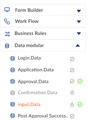
On the far left of the screen, the user will be able to access all the assets/files that are part of the application development. The user can expand this explorer to view all the assets and their names in detail. They can also search the asset library by typing the name of any of the assets into the search bar provided at the top of the explorer. On the right of each asset, a green validation symbol will indicate whether the asset has been validated (if the asset is not validated, the variation symbol will not be shown). Next to each asset, the user will one of the two icons, (edit) or (locked). When the user sees the edit icon, that means that no one in the team has claimed the asset for editing. So the user can choose to start editing that asset. But that locks it for everyone else who has edit access to that asset. So, when a user sees a lock icon next to the asset, and the asset name is shown in orange, then the user is the one editing the asset and no one else has access to it until he releases it. And when there is a lock symbol next to the asset with grey colour asset name, then someone else is editing that asset and the user can request access by clicking on that asset.
Icon Index:
Toolbar:
The tool bar contains 5 buttons that are essential for all the development and deployment activities of the entire application. The buttons correspond to actions that will affect the aspects of the entire application or other modellers that are not currently in use.
Icon Index:

Add new asset

Simulate the application

Publish the application

Publish the application

Generate
Each icon above has a very specific functionality and any changes made in this toolbar will affect the whole application unlike the Asset control panel, where the changes will only be reflected in the asset that the user is working on. Let’s go a little deeper on what each individual icon/button on the toolbar is capable of.
Add New Asset:
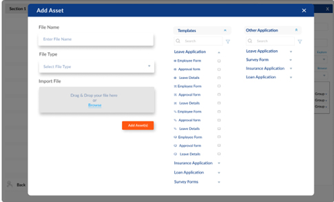
When this ( ) button is clicked, the user will see a pop-up that will allow them to add any type of asset to be added into the application. The user will be able to create a new file/asset and name it and choose the type by clicking on the drop down. Or they can drag and drop the asset from their local machine. The pop-up will also allow the user to import assets from other applications within the same workspace or from pre-existing templates provided by IntelliFlow.
The user will be able to add drools from their local machine by dragging and dropping or by clicking on the “Browse” option. The drool files will appear in the rule engine section of the asset explorer once the user is done adding the files. All the other files that the user has imported/added into the application will reflect in the asset explorer according to the file extension they carry by default which means, the user doesn’t have to move the assets to the corresponding folder. All these selections can be made with the pop-up shown below.
Simulate:
When this () button is clicked, the user will be taken to the end user view of the entire application. The user will be able to enter data in the form builder fields and submit using different personas just like an end user would. This feature will give the citizen developer an end to end view of the whole application and to see if the application is ready to be published. When this action is performed, the assets in the application workspace will be validated all at once. If there are any errors, the simulation will not be performed and the errors will be shown to the user.
Publish:
When this () icon is clicked, the user will be able to publish the application into the IntelliFlow Apps space in both web and mobile versions simultaneously. This one click publish button will give the user an easier way to publish into multiple platforms with minimal effort. The user can also choose to restore the previous versions of the application. This can be done in the mini-app/dashboard of IntelliFlow Studio by clicking on the three dots on top of the application card and selecting “Version history”.
Map:
This feature is what makes IntelliFlow the cutting edge platform it is and what sets us apart from our competitors and pushes us miles ahead in low-code development. When this () icon is clicked, the user will be prompted to a pop-up screen that is pacific to the current asset they have selected. Mapping is done between multiple assets that are not in the same modeler type. This allows the user to start building the application from any modeler. IntelliFlow studio allows the user to start building the application with many starting points. The user can start from a form, a workflow or a data modeler. At the end, the user can simply click on the map icon and connect all the different modelers they have created.
Note: How the pop-ups will look like and how the user can map each asset to the other will be elaborated in a separate document. It will be linked here once completed.
Generate:
When this () icon is clicked, the user can generate an asset that corresponds to the one that they are working on. For example, when the user is done creating a WorkFlow, they can click on the generate icon and the user will be able to automatically create both data modeler and forms that will be mapped to this workflow intrinsically and if the user chooses to, they can edit all the assets that are generated from this. The generate button works by following a very specific modeler relationship. This will be explained in more detail in another document. Once finished it will be linked here.
Control Panel:
The control panel can be found on the right most part of the screen when the user is working on developing an application on IntelliFlow Studio. The actions performed in the control panel will be specific to the asset that the user has claimed to edit and only one user can edit an asset at any point.
Icon Index:
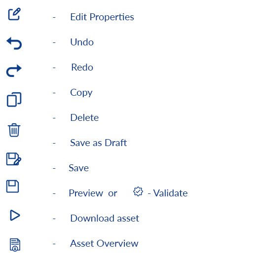
Edit Properties:
The properties of each individual field that the user is working on will be shown when this icon is clicked. For example, when the user is working on a .bpmn file, and dragged a human task component onto the canvas, then the properties related to that component will be shown here.
Undo:
This button will help you undo the most recent action. But some actions cannot be undone like save, save as draft, download asset etc.,
Redo:
This button will redo the last action that was undone. This button is activated when the user uses the undo button.
Copy:
When this icon is clicked, the entire asset will be copied onto the clipboard. The user can paste it wherever they see fit. This action is useful when the user wants to reuse the asset somewhere else within the workspace
Delete:
This icon will delete the entire asset that the user is working on. Once an asset has been deleted, it will remain in the trash folder which can be found under the profile section of the user for 30 days. After that if the user doesn’t restore the asset, it will be permanently deleted from the workspace
Save as Draft:
When the user has claimed the asset to edit and started making changes, they can use this icon to save as draft. The changes will be saved on the local machine but will not be uploaded to the master branch and the people who have viewing rights to this asset will not see the changes made.
Save:
When the user has made edits in the asset that they have claimed, they can use this cicon to save the changes and commit them into the master branch. That means all the changes made and saved will be visible to others with viewing rights to that asset. Unlike ‘Save as draft’ the changes made will be saved in the cloud and not on your local machine.
Preview/Validate:
The preview icon will appear when the user is working on an asset with the extension .frm i.e, when the user is working on a form. So, when the user clicks on this button, they can preview the form as it would appear to the end user or the user that will use the final published application.
whereas a validate button would appear when the user is working on an asset that has the extension of either .bpmn or .dmn. So the user will be able to validate the workflow and business rules. If there are any errors while validating the assets, they will be shown at the bottom of the screen when the user can drag the portion of the screen to appear bigger. The platform will also suggest the user with all the necessary changes they could make to rectify those errors.
Download Asset:
When this icon is clicked the user will be able to download the asset they are working on onto their local machine. The extension of the asset will remain as the original when this operation is executed. But the user can choose to change the file format by right clicking on the icon to change the format of the file they intend to download.
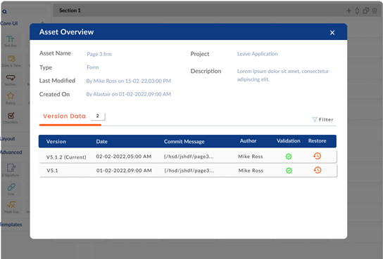
Asset Overview:
When this button is clicked, the user will see a pop-up on the screen that will give them the details of the asset such as the file size, the type offline, who has access to it etc. Along with these, the user will also be able to see the previous versions of the asset and the details of the user that last edited that asset. If they choose to, they can restore the asset to their previous versions by clicking on the restore icon on the right most corner of the version they want to restore.
Mobile App:
Objective:
The following document will give the end-users the direction to use the mobile app owned by IntelliFlow Solutions Private Limited (Hereby referred to as IntelliFlow) and a detailed view of utilizing the mobile app to achieve the best results. To access the IntelliFlow Mobile App, one must have a valid account. In the process to create one, please follow the below instructions to create a username and password for the first time.
Login:
Step 1: Click on the link
You will receive a first-time login link via your email address.
- Click on the received link to continue to the first-time login. (Follow step 3 if already signed up)
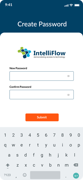
Step 2: Create Password
By clicking the link received in step1, you will get the below screen.
- Enter a password in the ‘New Password’
- Re-enter the same password in the ‘Confirm Password’
- Click on ‘Submit’.
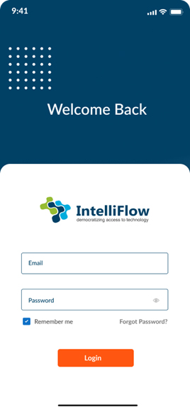
Step 3: Log in
You will be redirected to the login screen.
- Enter the ‘Email’ & ‘Password’ created in step 2.
- Click on ‘Login’.
- You can check the ‘Remember me’ checkbox for easier login.
(Your password will never be stored by IntelliFlow, only your Email ID will be saved to give you quick login experience next time you login.)
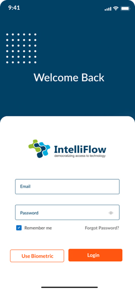
Step 4: Login via a Biometric method
For easy and quick login experience you can use biometric data (Touch ID /Face ID) to log in;
- Re-enter the password to log in via the biometric method.
- Click on the ‘Use Biometric’ button to log in using face ID/ touch ID.
- If you don’t want to use biometric method, then click on ‘Login’
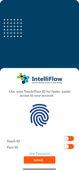
Step 5: Access to Touch/Face ID
After clicking on ‘Use Biometric’ button, you will be redirected to the below page.
There are toddle buttons for both, Touch ID and Face ID.
- To give access to the Touch ID, turn on the orange toddle button next to Touch ID.
- To give access to the Face ID, turn on the orange toddle button next to Face ID.
- To give access to both, turn on both toddle button.
- Then click on Submit.
Step 6: Dashboard
After successful login you will be landed on the following screen, where you get following features like Notification screen, To-do list and Home page.
To access the dashboard, click on the icon at the bottom left of the page to use the applications as per the requirement.
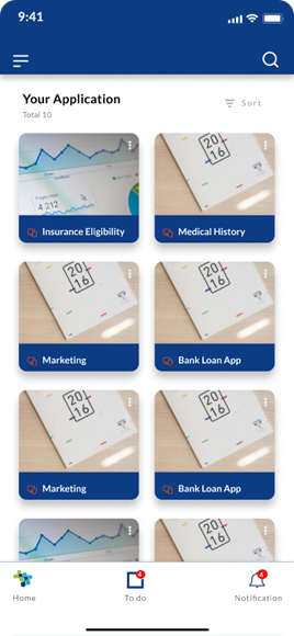
- Click on the icon to sort the applications.
- This feature allows you to sort the applications by alphabets or recent/frequent activities.
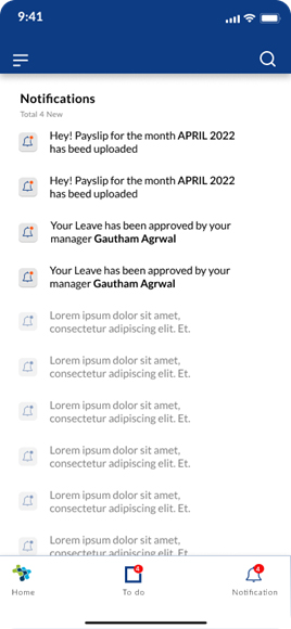
Notifications:
- Find all of your notifications by clicking the bell icon in the bottom-right corner of the screen.
- By this pop-up, you can scroll through all of your notifications related to the mini-apps you have access to. Unread notifications will be highlighted.
- Click the notification you want to read; it will redirect you to the page associated with the notification.
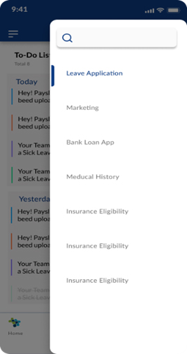
To-do list:
- Click on the icon to get the do-to list of all the applications.
- Click on the top right (under the search bar).
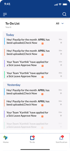
- After clicking that you will get an option on top to filter out To do lists for the specific application.
- Click on ‘All App’ if you want to see the to do list from all the apps.
- Click on ‘Select An App’ if you want to see the to do list from the specific app.
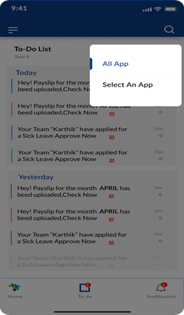
- Once you click on ‘Select An App’ you will get following options where you can select the application as required.
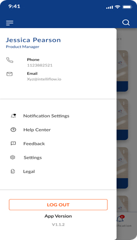
Menu:
1. Click on the icon at top left corner of the Dashboard screen to explore the Menu
2. Click on the setting that you’d like to update from the options in the left sidebar.
Settings include things such as:
- Profile Settings:Edit the basics, such as your name, username or email address.
- Notification settings: You can go to your Notification Settings to change what you’re notified about and how you’re notified.
- Language Settings:Select the language that you want to use.
- Settings:Change your password, and turn on the Touch ID to login by Touch ID and keep your account secure.
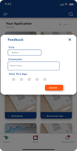
- Feedback:Fill in the fields to give your feedback and rate the app.
- Logout: You can logout the account whenever you want by clicking on the bottom left button.
Profile Settings:
- Click on ‘Phone’ to edit your username at the top left of the screen.
Click on ‘Email’ to edit your email address similar to username setting.
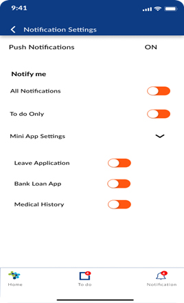
Notification Settings:
- Click on Notification settingsto change what you’re notified about and how you’re notified.
- Turn the ‘Push Notification’ ON to get notification updated.
Then you can customize the way you receive notifications.
- Turn on the toggle button opposite to All Notifications to get notified of all the app updates.
- Click on ‘To do Only’ to get notified only from To do List.
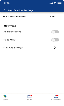
- By clicking on Mini App Settings you can choose to get notified from a specific app.
- Turn on the toggle button opposite to the app you want to get notified about.
Language settings:
By clicking on ‘Language’ you will get multiple options of languages.
Click on the language you prefer to explore the app with more ease and comfort.
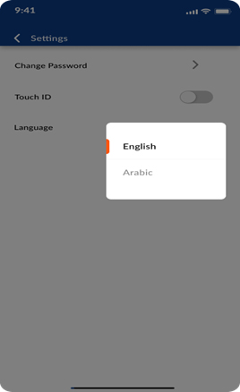
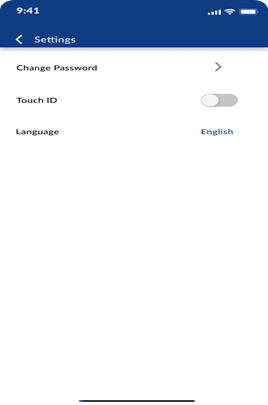
Settings:
- Click on ‘Change Password’ to Change your password.
- Turn on the Touch ID to login by Touch ID for quick login.
- Click on the language you prefer.
Feedback:
You will be redirected to your email account with the to address bar already filled. Please give us your thoughts and feedback on how to improve our app
Log-out:
You can logout the account whenever you want by clicking on the bottom left button of the menu bar.